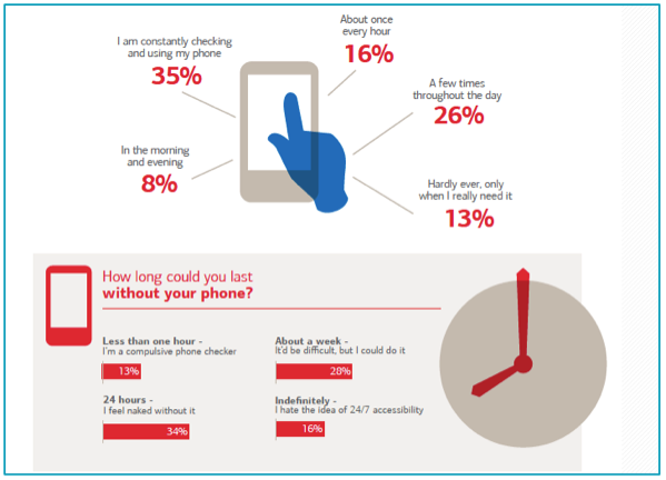
You’ve heard it before, but Mobile Advertising continues to grow at a staggering pace and Americans are using their phones more than ever. Last time we talked about it on our blog, Content Specialist Sam said, “Out of 318 million Americans, 111 million are on their phone now and continue to check them frequently.” (For more info on this, read the rest of his blog here.) To emphasize my point a little further, people pick up their phones 150-200x per day (we’re calling these “mobile moments”). Within the U.S., there are roughly 30 billion of these “mobile moments,” which gives marketers a few chances to get their messaging across. These are incredibly high numbers the U.S. is putting up.

*I took this from Sam’s blog mentioned earlier, but it helps to explain my point.
Because of the potential advertisers and businesses have with Mobile, you want to make sure you’re following some best practices. So, in today’s blog, we’re going to look at best practices of mobile ad development. Specifically, we’ll look at ad layout, mobile specific extras, and ad messaging.
Layout
First of all, keep your ad simple. Because of screen size, you have limited “real estate” to capture someone’s attention. You have roughly two seconds to convey your message before someone will move on. To go along with this, the best way to capture attention is through imagery. Use graphics that are universal but captures your overall message. Like the ancient Athenians said, a picture’s worth a thousand words. Finally, and it may seem obvious, but have a call-to-action button. Call-to-actions can persuade someone to click on an ad and tells someone to perform a specific action you want them to make.
Extra Extra
With current mobile technology, you have the ability to add in mobile-specific features you otherwise would not have on desktops. Below is a list of the best performing “add-ons” we have seen, based on engagement.
- Direct app downloads – helps to promote your app and drive downloads.
- Sitelink extensions (SEM) – gives users additional options to land on specific pages of your site.
- Click-to-Call – gives users the ability to call you directly by clicking on your ad.
- Location extensions (SEM) – displays your physical location in additional to your ad text.
- Reviews (SEM) – users have the ability to see your overall ratings from right in your ad.
While some of these may not work for your business goals, they provide additional opportunities for you to give the information your customers are seeking.
Message
Like I mentioned for ad layout, your messaging should also be simple. You only have a few seconds to get your point across, don’t get lost in the weeds with needless information. But, probably the most important aspect of messaging is A/B testing. A/B test everything: body copy, call-to-action button copy, imagery, and color. One main way to know if your ads a performing at the level you want is by testing them against different messaging or style. Also, tailor your messaging to the specific locations and audiences your targeting. What might work for one group may not work for another.
All in all, the most important thing on mobile is to provide your audience with a pleasant, useful experience. Providing the information potential customers want, when they want it, will help to grow your customer base and keep them coming back for more. If you want to read about Mobile Advertising some more, you can download our Mobile Whitepaper by filling out the form below.